CSS3 transitions allows you to change property values smoothly (from one value to another), over a given duration.


How to Use CSS3 Transitions?
To create a transition effect, you must specify two things:
- the CSS property you want to add an effect to
- the duration of the effect
Note: If the duration part is not specified, the transition will have no effect, because the default value is 0.
The following example shows a 100px * 100px red <div> element. The <div> element has also specified a transition effect for the width property, with a duration of 2 seconds
Specify the Speed Curve of the Transition
The
transition-timing-function property specifies the speed curve of the transition effect.
The transition-timing-function property can have the following values:
ease- specifies a transition effect with a slow start, then fast, then end slowly (this is default)linear- specifies a transition effect with the same speed from start to endease-in- specifies a transition effect with a slow startease-out- specifies a transition effect with a slow endease-in-out- specifies a transition effect with a slow start and endcubic-bezier(n,n,n,n)- lets you define your own values in a cubic-bezier function
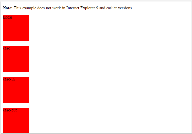
The following example shows the some of the different speed curves that can be used:
<!DOCTYPE html>
<html>
<head>
<style>
div {
width: 100px;
height: 100px;
background: red;
-webkit-transition: width 2s; /* Safari */
transition: width 2s;
}
/* For Safari 3.1 to 6.0 */
#div1 {-webkit-transition-timing-function: linear;}
#div2 {-webkit-transition-timing-function: ease;}
#div3 {-webkit-transition-timing-function: ease-in;}
#div4 {-webkit-transition-timing-function: ease-out;}
#div5 {-webkit-transition-timing-function: ease-in-out;}
/* Standard syntax */
#div1 {transition-timing-function: linear;}
#div2 {transition-timing-function: ease;}
#div3 {transition-timing-function: ease-in;}
#div4 {transition-timing-function: ease-out;}
#div5 {transition-timing-function: ease-in-out;}
div:hover {
width: 300px;
}
</style>
</head>
<body>
<p><b>Note:</b> This example does not work in Internet Explorer 9 and earlier versions.</p>
<div id="div1">linear</div><br>
<div id="div2">ease</div><br>
<div id="div3">ease-in</div><br>
<div id="div4">ease-out</div><br>
<div id="div5">ease-in-out</div><br>
<p>Hover over the div elements above, to see the different speed curves.</p>
</body>
</html>


No comments:
Write comments