What is Responsive Web Design?
Responsive Web Design makes your web page look good on all devices (desktops, tablets, and phones).
Responsive Web Design is about using CSS and HTML to resize, hide, shrink, enlarge, or move the content to make it look good on any screen:

Create Your Own Responsive Design
One way to create a responsive design, is to create it yourself:
<!DOCTYPE html>
<html lang="en-us">
<head>
<style>
.city {
float: left;
margin: 10px;
padding: 10px;
max-width: 300px;
height: 300px;
border: 1px solid black;
}
</style>
</head>
<body>
<h1>Responsive Web Design Demo</h1>
<h2>Resize this responsive page!</h2>
<div class="city">
<h2>London</h2>
<p>London is the capital of England.</p>
<p>It is the most populous city in the United Kingdom, with a metropolitan area of over 13 million inhabitants.</p>
</div>
<div class="city">
<h2>Paris</h2>
<p>Paris is the capital of France.</p>
<p>The Paris area is one of the largest population centers in Europe, with more than 12 million inhabitants.</p>
</div>
<div class="city">
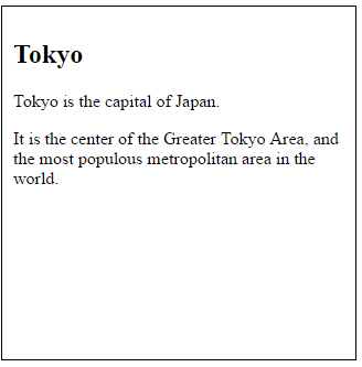
<h2>Tokyo</h2>
<p>Tokyo is the capital of Japan.</p>
<p>It is the center of the Greater Tokyo Area, and the most populous metropolitan area in the world.</p>
</div>
<div class="city">
<h2>New York</h2>
<p>The City of New York is the most populous city in the United States.</p>
<p>New York is an important center for international diplomacy and has been described as the cultural and financial capital of the world.</p>
</div>
</body>
</html>
ANSWER:
Responsive Web Design Demo
Resize this responsive page!


No comments:
Write comments